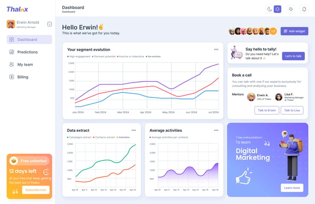
You can use the thalox Dashboard to visualize engagement insights, monitor data quality, and review predictions from your connected HubSpot data.
We are constantly working on expanding our dashboard to give you as many insights as possible into your data and the success of your predictions.
If you are not already on the dashboard page please click on “Dashboard” in the left navigation.
Currently, the following three dashboards are available:
- Your segments evaluation
- Data extract statistics evolution
- Average activities per contact evolution
Dashboard – Your segment evaluation

This dashboard shows you the number of contacts per segment that thalox has assigned for you based on our Thalox Engagement Score.
Please note: This graph is standardized based on our recommended Thalox Engagement Treshholds.
A good result would be when the “High Engagers” and/or the “Dormant Potential” is increasing over time.
“Inactive or Indecisive” should decrease at best.
In the example above – the report shows a lot of new contacts which were coming in the database.
If you only want to focus on one segment, it is possible to hide the other segments by clicking on the segment name.
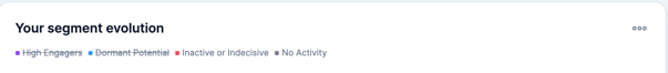
Each point on the graph shows a prediction. On mouseover, the exact values that make up the graph are displayed.
Dashboard - Data extract statistics evolution
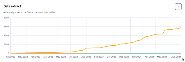
This dashboard shows you the statistical values that have been used for the displayed prediction. These are:
- Number of extracted Campaigns
- Number of extracted Contacts
- Number of extracted Activities
If you only want to focus on one extraction element, it is possible to hide the others by clicking on the extraction name. For better scaling, we disabled per default to show the extracted activities.
Each point on the graph shows a prediction. On mouseover, the exact values that make up the graph are displayed.
Dashboard – Average activities per contact evolution
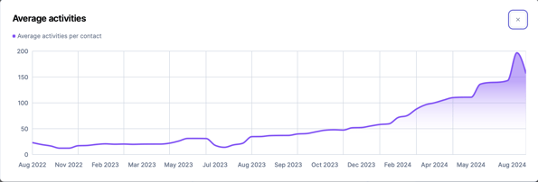
This dashboard shows you the number of activities per contact.
The graphic shows that the number of activities is increasing.
Always keep your evolution of contacts in mind. Looking at the “Segment Evolution” dashboard it shows an increasing number of contacts which can bring the average down.
The points on the graph each show a prediction. On mouseover, the exact values that make up the graph are displayed.
Updated February 2026